

The Psychology of Color in Your Scarf
In this article, learn about color theory and how it can help you create cohesive, stylish looks.
In this article, learn about color theory and how it can help you create cohesive, stylish looks.
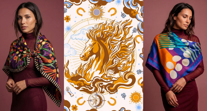
Choosing the color of a scarf is not just about matching your clothes. Each shade carries a psychological association that changes how people perceive the person wearing it, even before a single word is exchanged.

Color psychology studies how specific shades trigger emotional reactions and cultural associations. In clothing, this translates into practical decisions: red draws attention and conveys energy, blue conveys trust, black suggests authority.
Three technical variables explain why the same color can communicate different things: hue (the shade itself, such as red or blue), saturation (how vibrant or muted the color is) and value (how light or dark it is). A saturated, dark red communicates intensity; the same red, muted and light, like a soft coral, communicates lightness.
The color red is linked to passion and boldness. A red scarf around the neck or on a bag works as the focal point of a neutral look, signaling confidence without the need for any other accessory. At lower saturation, like an earthy red, the same color communicates sophistication instead of urgency.
The color blue is the one most associated with stability and reliability, which is why it appears so often both in corporate settings and in outfits meant to convey security. Deeper blues, such as navy, reinforce this sense of control even further.
The color black communicates sophistication and control. A black silk scarf has this effect even on a simple piece, because the color absorbs light and draws the eye to the texture of the fabric rather than the print.
Earth tones and moss green have been gaining ground in recent collections because they evoke something more natural and less performative, a response to the excess of saturated colors of recent years.
Both white and neutrals work as a base: they communicate simplicity and leave room for other elements of the look to stand out, such as jewelry or the print of another piece.

Two combination principles help with the practical choice. Analogous harmony uses colors that sit close together on the color wheel, such as blue and green, creating a calm, cohesive effect. Complementary contrast, such as blue and orange or red and green, creates a point of visual tension that draws attention, useful when the goal is for the scarf to be the highlight of the look.
A neutral scarf over a boldly colored outfit follows the opposite logic: instead of reinforcing, it balances, letting the base piece be the star.
For meetings and formal settings, shades such as navy blue and black reinforce the perception of control. For social events, colors such as red and coral bring more presence. For everyday wear, earthy and neutral tones offer versatility without requiring much planning to coordinate.
It is also worth considering the effect of color near the face: warm shades such as coral and terracotta tend to brighten skin with warm undertones, while blues and jewel tones flatter skin with cool undertones. This is one of the reasons why the same scarf color "looks great" on one person and seems "washed out" on another.
In the silk scarf collection from Scarf Me, this logic comes through in styles ranging from classic solid black to prints with a livelier palette, designed for every type of occasion and desired effect.
Shades of blue, especially navy blue, are the most associated with reliability and control, which makes them common in work settings and formal situations.
Yes. Color psychology shows that specific shades trigger automatic associations, such as red with energy and black with sophistication, before any verbal interaction.
Yes, especially for those who want versatility. Neutral tones go with more pieces and work as a base for accessories in stronger colors, such as jewelry or bags.
Skin with warm undertones is usually flattered by colors such as coral, terracotta and gold. Skin with cool undertones pairs better with blues, purples and jewel tones such as emerald.
Select options